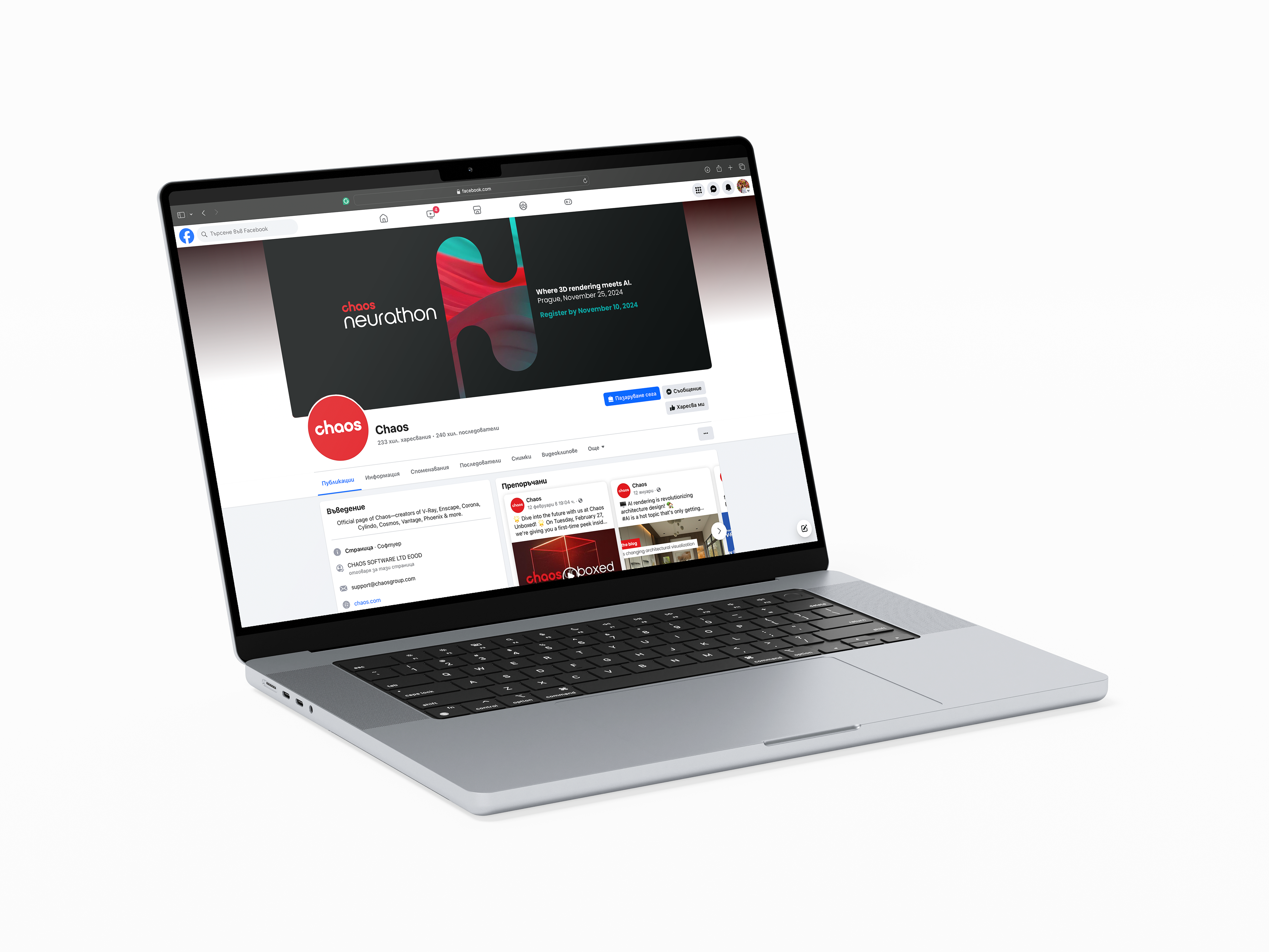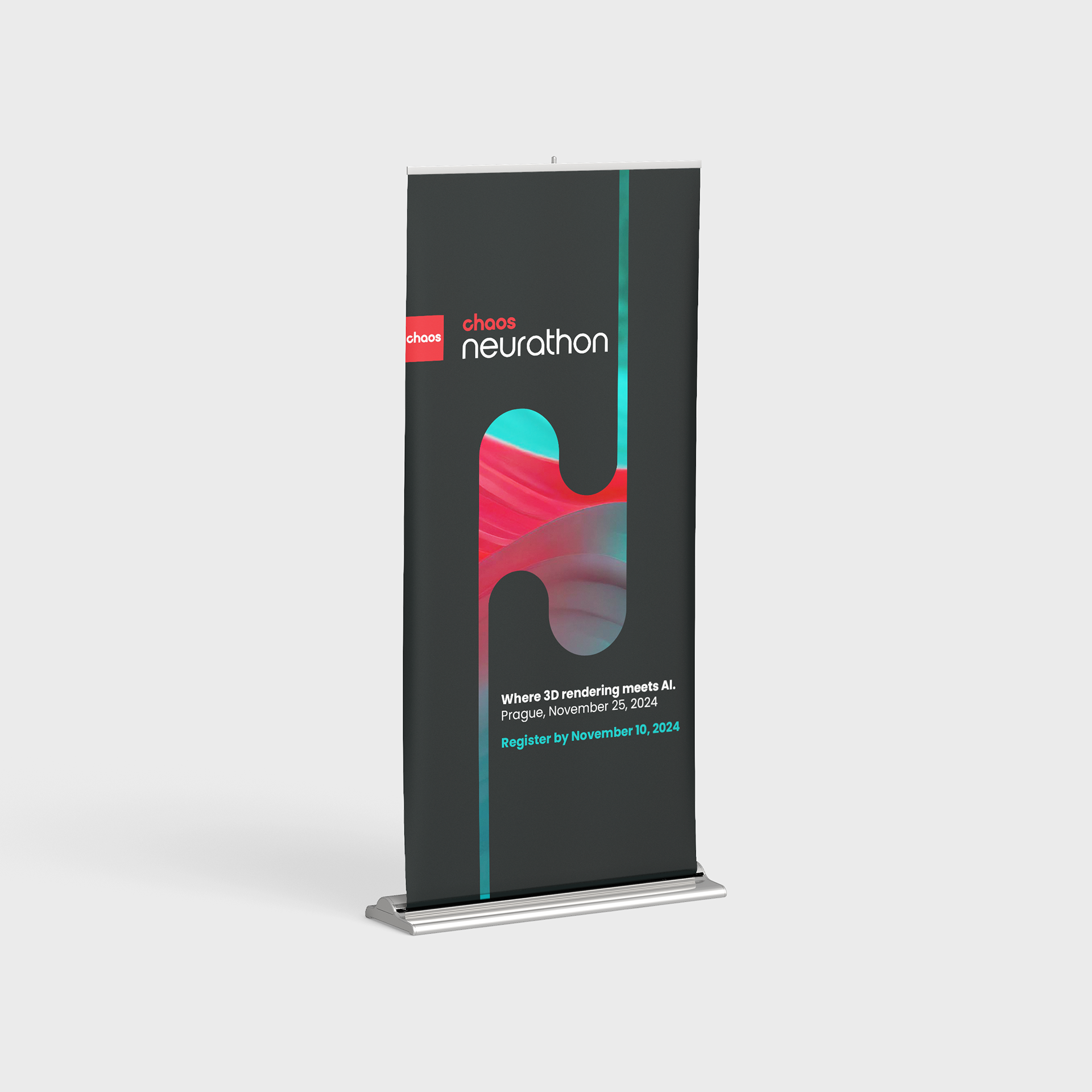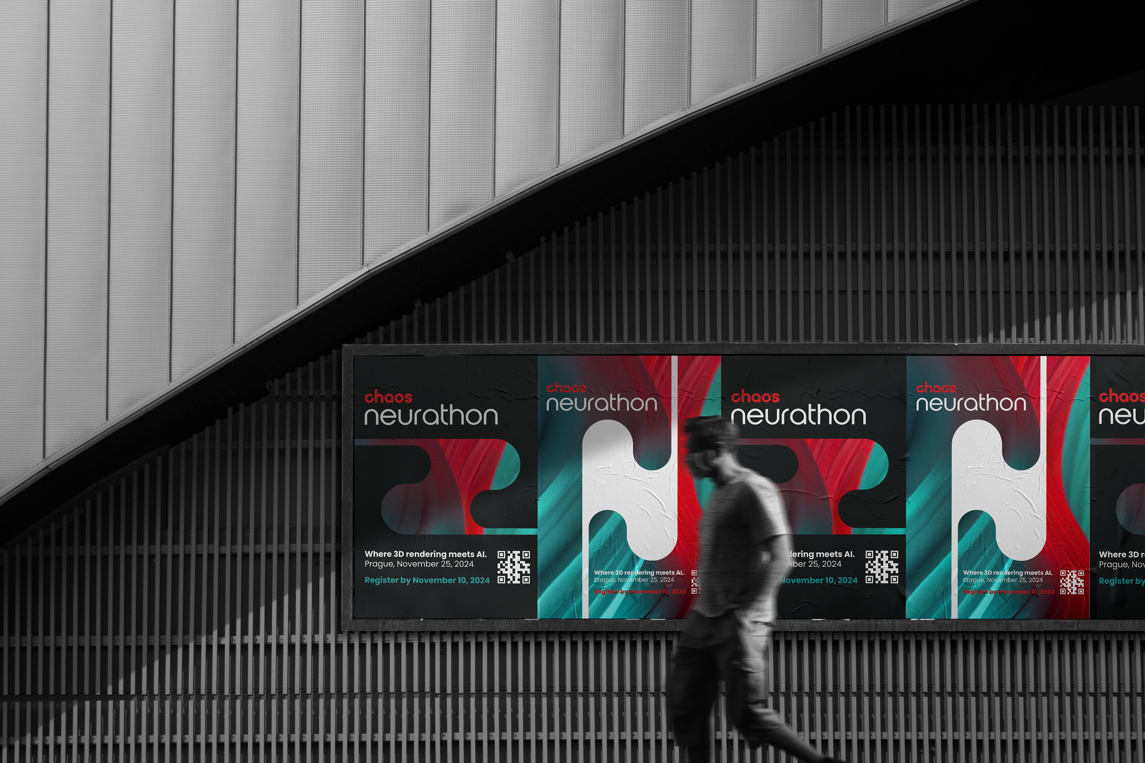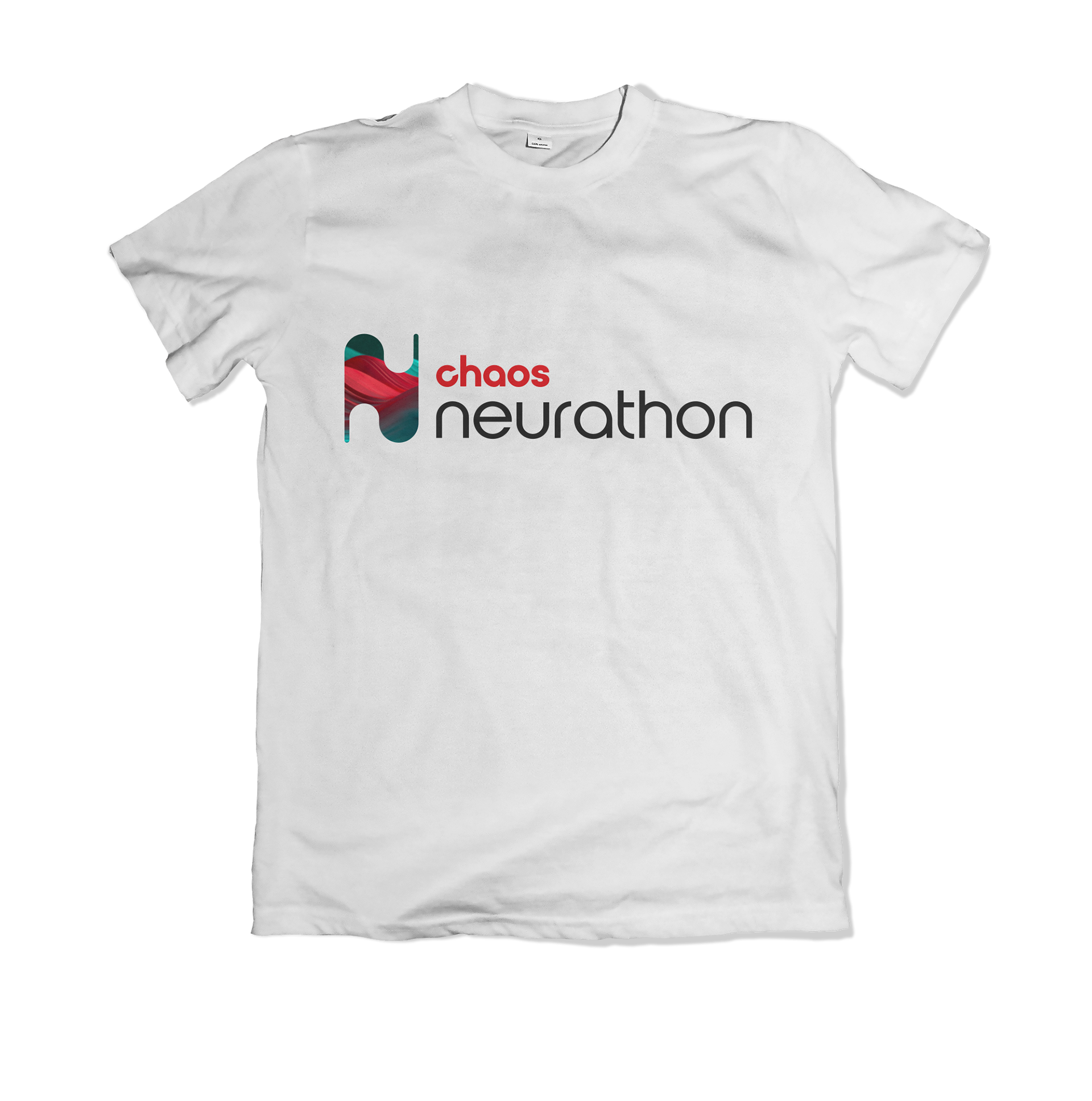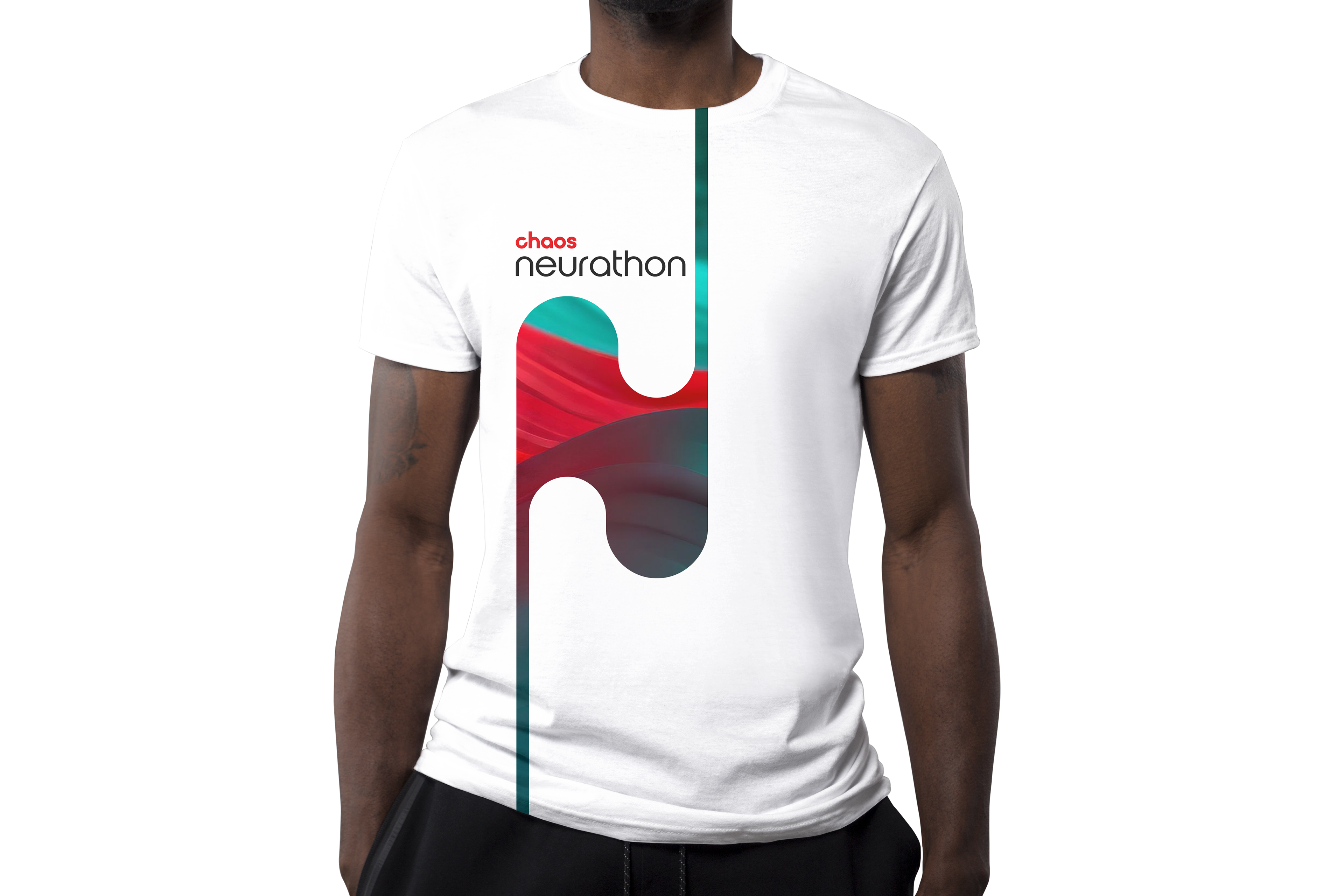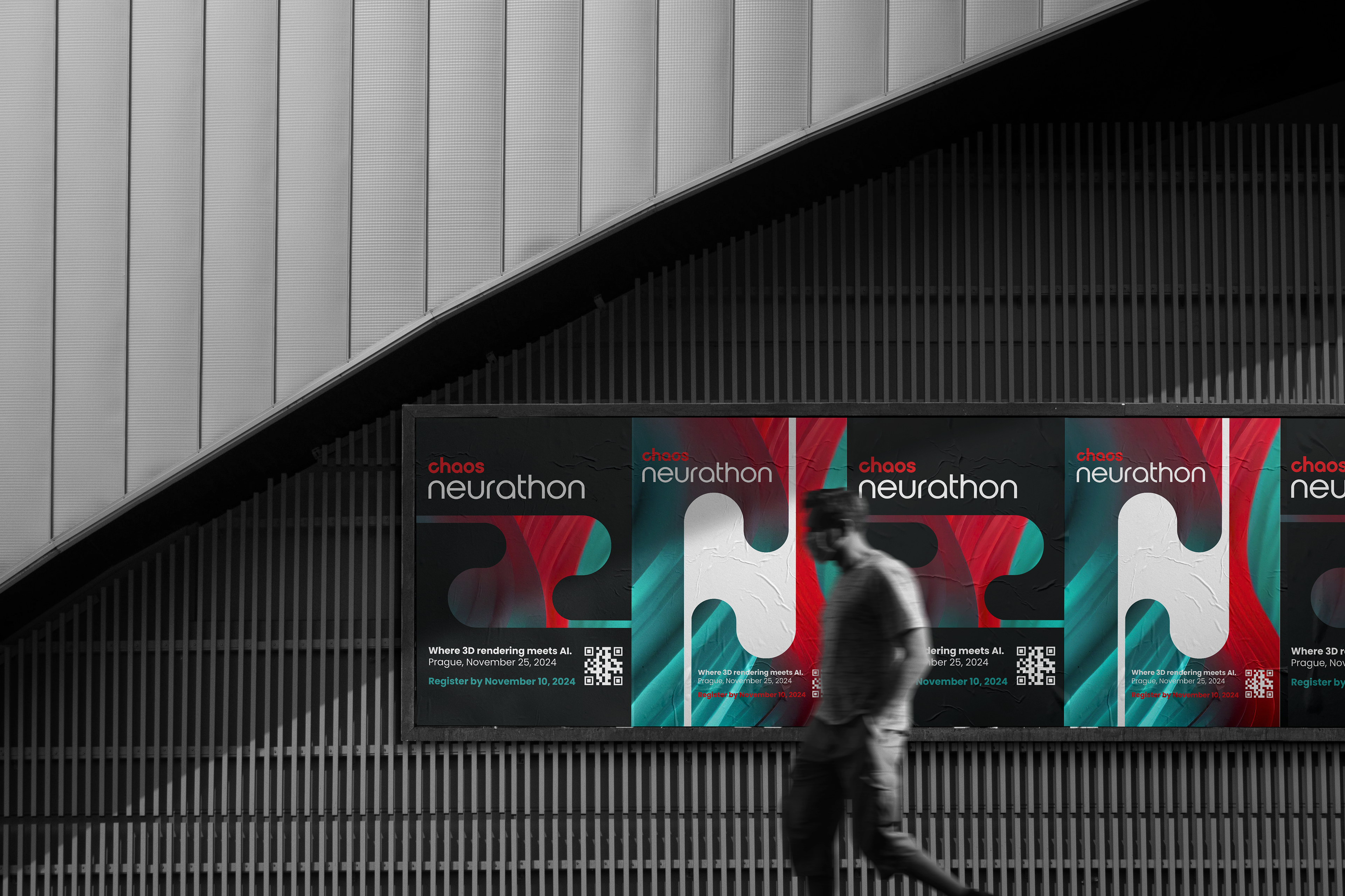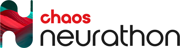
This project showcases my creative approach to branding the Chaos Neurathon event.
The logo is built around a stylized letter “N”, directly inspired by the event name Neurathon. The fluid shape of the letter reflects the organic movement of a sheet of paper, symbolizing the fusion between traditional artistic expression and advanced AI technology.
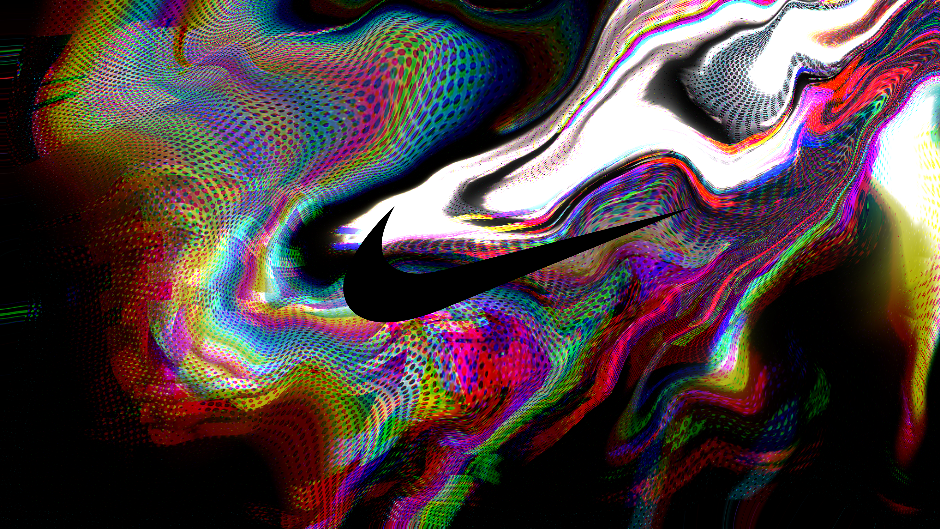
The central visual was initially generated using AI and later refined in Adobe Photoshop. The post-processing phase focused on improving composition, correcting visual imperfections, and enhancing color depth and vibrancy to achieve a polished final result.
For the color palette, I aimed to align with the Chaos visual identity while introducing a bold, energetic feel. The combination of rich reds and turquoises creates contrast, dynamism, and a sense of creative momentum, reflecting the innovative nature of the event.